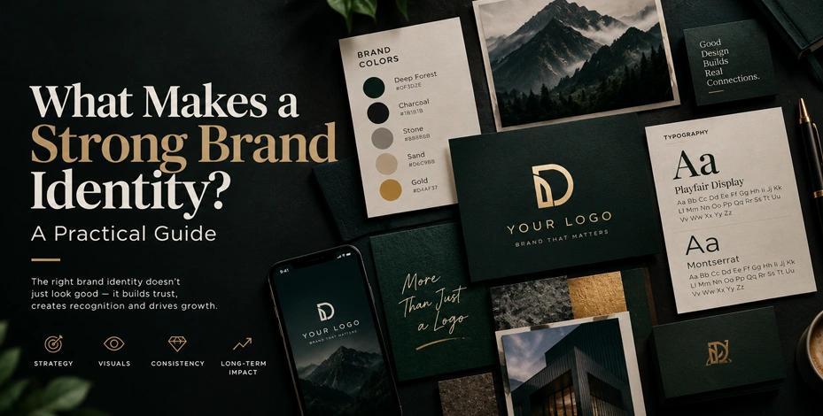
What Makes a Strong Brand Identity? A Practical Guide
A lot of business owners think "brand identity" means "logo." A logo is part of it — but a strong brand identity is a system, not a single asset. Get the system right, and every touchpoint your customer sees, from your website to your business card to your Instagram feed, reinforces the same impression. Get it wrong, and even a great logo won't save a brand that feels inconsistent or forgettable.
The foundation comes before the visuals
Before any design work happens, a strong brand identity starts with answers to a few plain questions:
- Who is this brand actually for? Not "everyone" — a specific customer with specific needs.
- What does this business do differently than the competition? If you can't answer this in a sentence, your brand messaging won't be able to either.
- What feeling should someone have after interacting with this brand? Trustworthy and premium reads very differently than fun and approachable — and that feeling should shape every visual decision that follows.
Skipping this step is the most common reason brand identities end up generic. A logo designed without this foundation might look fine in isolation but won't actually differentiate the business from anyone else in its category.
The visual system itself
Once the strategy is clear, the visual identity typically includes:
- Logo — usually a primary version plus simplified variations for small spaces (social media icons, favicons).
- Color palette — a primary palette plus supporting colors, chosen deliberately rather than "whatever looks nice," since color carries real psychological weight (worth its own conversation, but the short version: color choice should follow from the brand's personality, not the other way around).
- Typography — a small, consistent set of fonts used the same way everywhere, rather than a different font on every page.
- Imagery style — a consistent approach to photography or illustration so visuals feel like they belong to the same brand wherever they appear.
Why consistency matters more than any single asset
A brand identity's real value shows up in repetition. A customer who sees the same colors, tone, and visual style across your website, social media, packaging, and email signature builds recognition faster — and recognition builds trust. A beautiful logo used inconsistently (different colors on different platforms, no defined spacing rules, mismatched fonts in supporting materials) undercuts its own value.
This is what brand guidelines are for: a simple reference document that keeps everyone — your team, your printer, your web developer — using the identity the same way, so the brand stays consistent even as more people touch it.
Signs it might be time for a rebrand (not just a refresh)
A full rebrand makes sense when the business itself has fundamentally changed — new target audience, new positioning, a merger, or a brand that no longer reflects what the company actually does. A visual refresh (updated colors, modernized logo, cleaner typography) is usually the right call when the core brand strategy still holds true but the execution feels dated.
If you're weighing either option, our branding services page outlines how we approach both, or take a look at our portfolio for examples of brand identity work.
Recent Posts

October 22, 2026


September 23, 2026